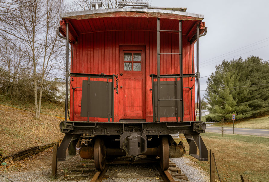
The color of railroading . . .
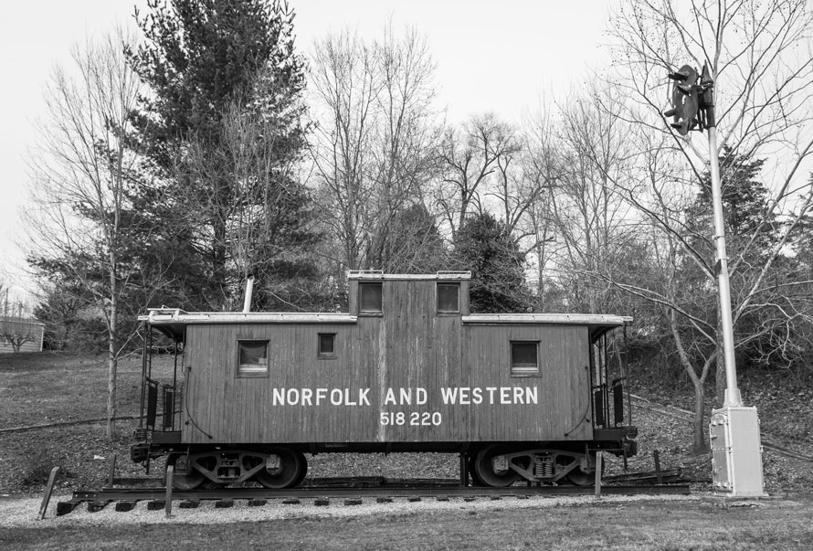
A while back, a friend said to me that in his opinion, black and white is the color of railroading. I didn’t disagree. When we look at well known railroad photographers, most all of them worked in black and white. Richard Steinheimer, Jim Shaughnessy, Philip Hastings, O.Winston Link, David Plowden and many others produced outstanding bodies of work in black and white. In fact, there was a time that I would have said that the color of photography is black and white. Most of the great photographers that I admire worked in black and white. Of course, part of the reason for the predominance of black and white is that color came fairly late in the history of the medium.
Even though experiments in color began shortly after the invention of photography, color photography did not take hold until well into the 20th century. Kodachrome was introduced in 1936, and color negative film was developed and refined during the 1940s. Even after color film and processing reached technical maturity, “serious” photographers continued to work in black and white. It was not until the early 1970s that the color work of photographers like William Eggleston and Stephen Shore began to receive critical attention.
Digital technology has made color much more accessible, but often we shoot in color without thinking too much about using color as a means of expression. Color is just there. Perhaps that is why black and white often seems more “artistic.”
We now have the tools to manipulate color in much the same way that black and white tonality and value was manipulated in the darkroom. And we can use this unprecedented control over color to establish a mood, express an emotion or harmonize the composition.
If your intention is primarily documentary, or photo-journalistic, than recording accurate color may be the priority. But if you intend to use color as a means of expression, you would do well to study how painters use color to show not what things look like, but how things feel. Photography is not painting, but photographers now have the digital tools to use color expressively without forsaking the unique properties of photography.
Post processing sometimes gets a bad rap—we have all seen the overcooked HDR images—but do not think that editing the color in a photo is somehow “cheating.” After all, reducing all color to shades of gray to produce a black and white image is a rather extreme manipulation of color, and no one calls that cheating.
Perhaps color is indeed the “color of railroading.” We just need to learn all the ways to use it to create photos that satisfy our vision of what the railroad means to us.
Edd Fuller – Text and photographs Copyright 2018
Amen to your last sentence, Edd. For 25 years, I photographed almost exclusively in black & white, since I learned the craft from my father, and he photographed that way. Then I spent a dozen years shooting nothing but color print film, as my kids grew up and I did not have time for “real” photography. But perhaps I learned something, without even thinking about it much, about color. After going digital in late 2009, it really seemed like the world opened up, and I continue to have a lot of fun!
Thanks for sharing your thoughts on this, Oren,
I started in 1970, and shot black and white almost exclusively until my first digital SLR in 2007, when I began to take color more seriously. This was partly because the color was so much better than anything I had been able to do on film, and also because I was frustrated with digital black and white. Even though I did a lot of experimentation with different printers and ink-sets, I could never produce a digital black and white print that I was happy with, and continued to shoot film for B&W. But now I shoot mostly in color, and am trying to learn the possibilities. (Discovering the work of Saul Leiter has been a revelation in that regard.)
Edd, your comments are on the mark as far as I am concerned. Sometimes, color will detract a viewer and direct attention to colors present in the image, rather than the subject. However, color can be used to our advantage. Color grading can have a huge impact on the viewer, even to the point of creating a mood by simply adding a bit of cyan or blue to the shadows, or adding a slight hint of red and yellow to the shadows and highlights. To me, I think color should be under the control of the photographer, who actually becomes a visual artist through the editing process. Then, that “artist” can decide what mood the image should convey, and how it should be conveyed. Black and white as an art form is well established and has made tremendous strides in the digital world. Color, with the ability to change it through numerous forms and manipulations, is entering a world unprecedented since the introduction of color film. Both are necessary. Both are appreciated. It is entirely up to us to decide what tells the story and provides the best sense of place and time.
Well said, Danny. It comes down to thinking about color as carefully as we do line, tone and texture in our compositions.